Redesigned a data-heavy incident workflow to increase adoption, turning 8+ scattered and non-compliant workflows into a simplified experience
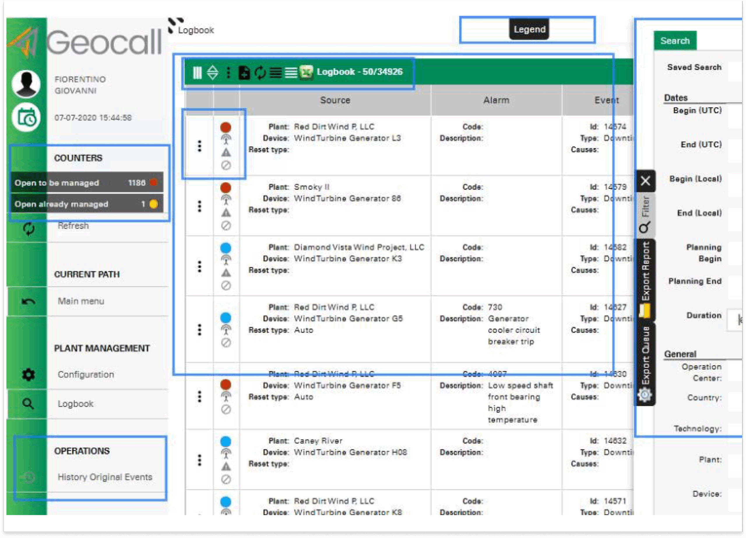
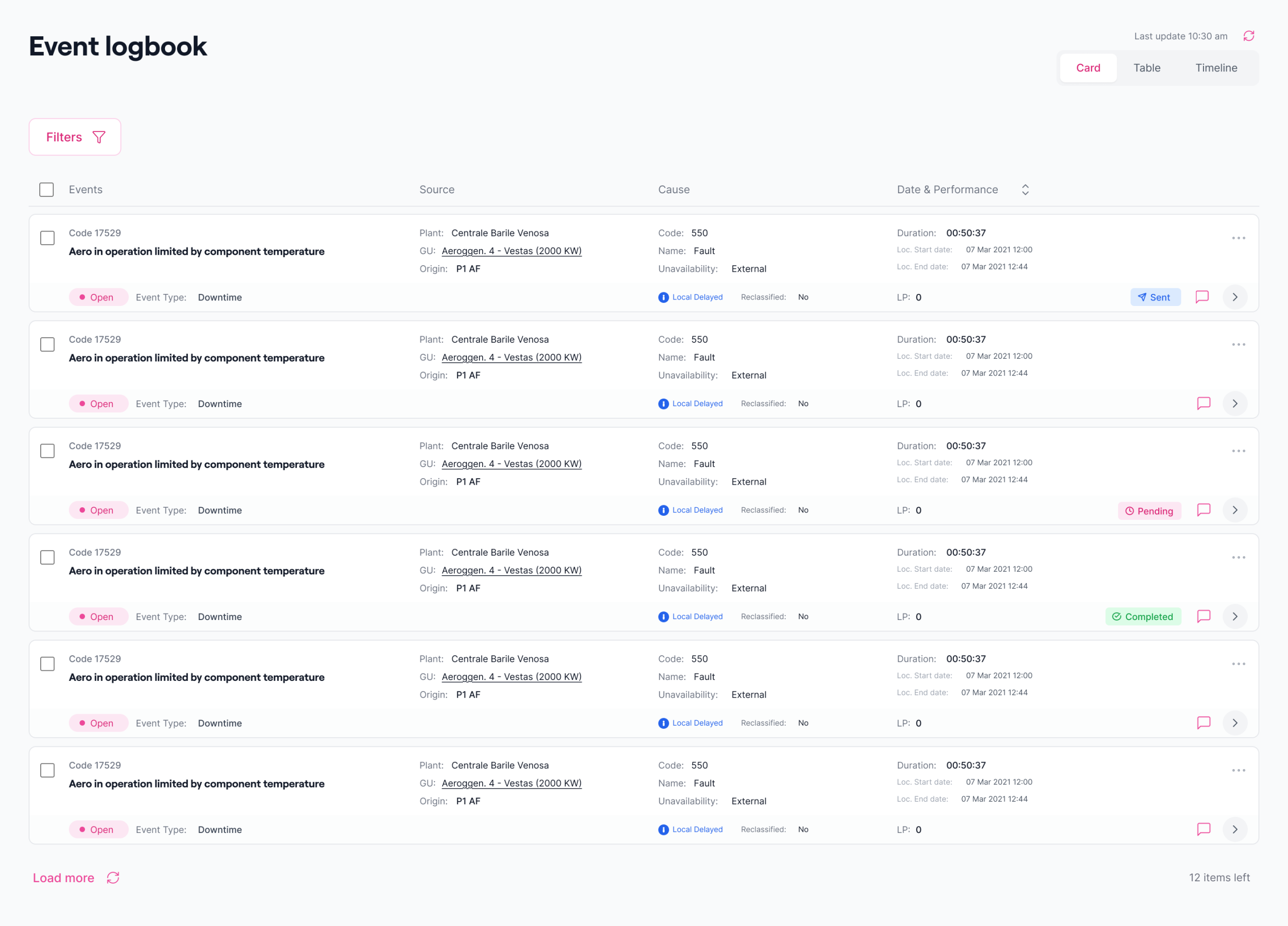
Before and after
Summary
I helped design Enel - Plant Operators and Management — a predictive incident management system that help energy operators make reliable decisions to fix remotely plant error, or sent crews on plant for manual fix. This work increased compliance, and transformed a legacy system into a centralized workflow across countries, turned operators from using 8+ tools to manage incidents, support faster reclassification with data-heavy incidents.
Focus: Compliance, adoption, and actionable insights
Design challenge
Design a compliant, unified experience across four countries to serve different working style. Tun complex data informations into clear, faster, and actionable insight.
Role & Scope
Title: Sr UX/Product Designer, Operational Efficiency
I led the end-to-end design; from research and mapping to final UX and system rollout, translating complex, technical informations, and user needs into a scalable, consistent solution.
Outcomes
- 2x faster incident reclassification response compared to the previous software
- +76% reclassified incident adoption through table mode compared to the previous card mode
- +38% incident reclassified under compliance compared to the total data source events on 1,475 operating plants
Problem Details
To meet growing demands, we built Enel — POM, a centralized experience empowering operators to track, monitor, and reclassify incidents, as the absence of scalable governance introduced business risk and operators frustration.
Pain Points
Operators needed visibility and control over incident without relying on different work around and tools. Control Room and Analysts spent hours validating false anomalies.
Why It Mattered
Operators delayed product decisions due to uncertainty and dispersed informations across emails, spreadsheet, etc. This meant wasted time, missed opportunities, and delayed decisions.
Opportunity
- Teams delayed product decisions due to uncertainty
- Detects incidents and changes automatically
- Scales to diverse user types
The goal was to transform data interpretation from a reactive, manual process into an intuitive, predictive experience built around explainability and usability.
The Research Process
I delved deeply into how each country operated, conducted customer testing and in-depth interviews across different teams, to understand how operators identified, interpreted, and acted on anomalies.
UX Challenge
- Finding common ground across different cultures and working styles
- Understand the problem, the domain, and the technical jargon
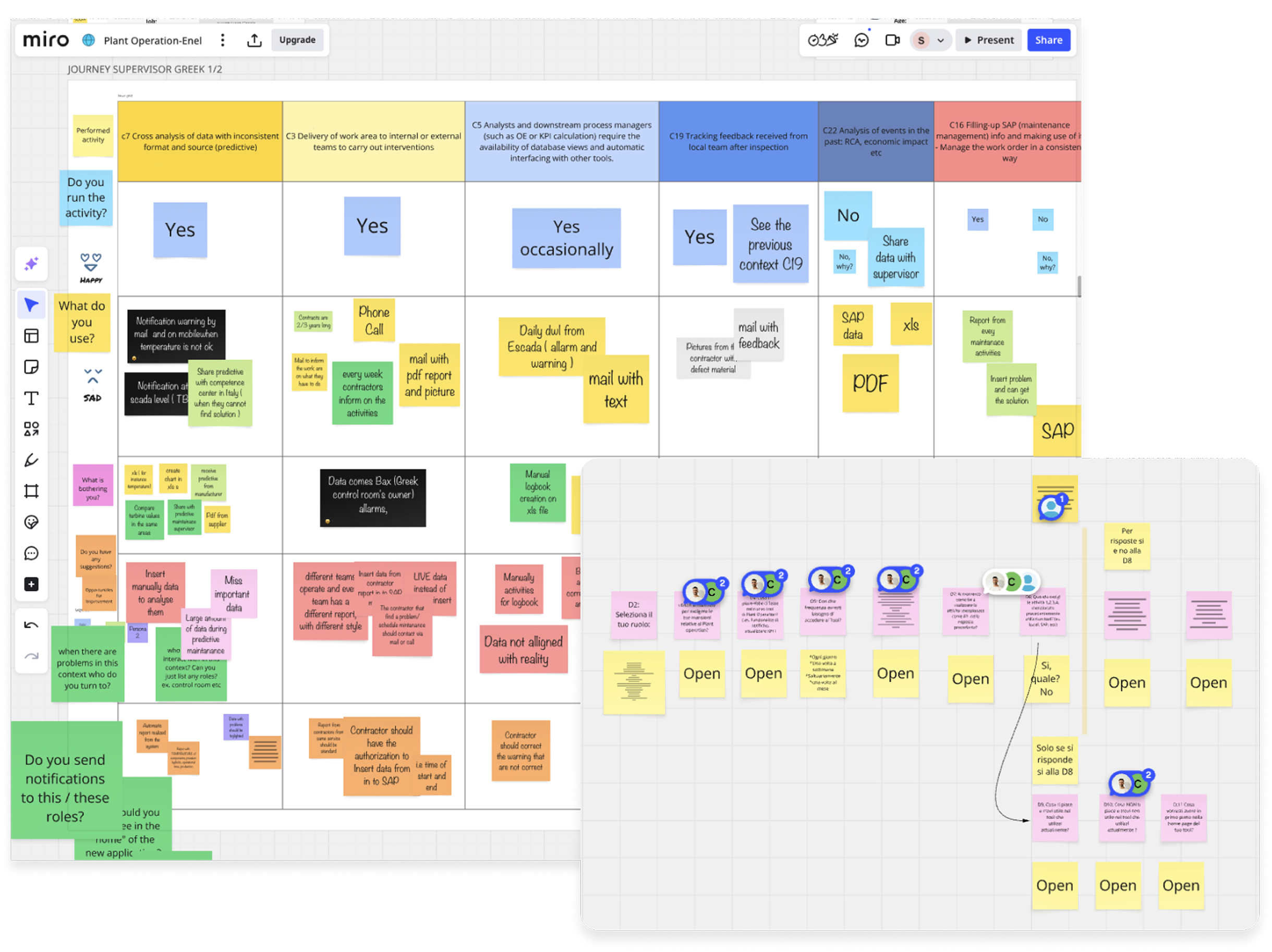
A Unified Journey
I turned fragmented insights into a unified journey by defining UX opportunities that aligned stakeholders on key requirements.
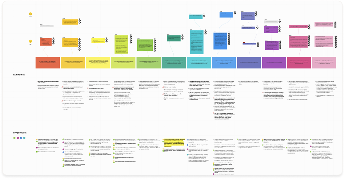
Key Findings
- Non-compliant workflows: operators shared different ways of working to reclassify incidents.
- Ease of understanding: operators needed clarity at a glance on the incident before investing time into technical consideration.
- Data-heavy: operators needed different informations upfront to reclassify at speed.
Exploring Initial Solutions
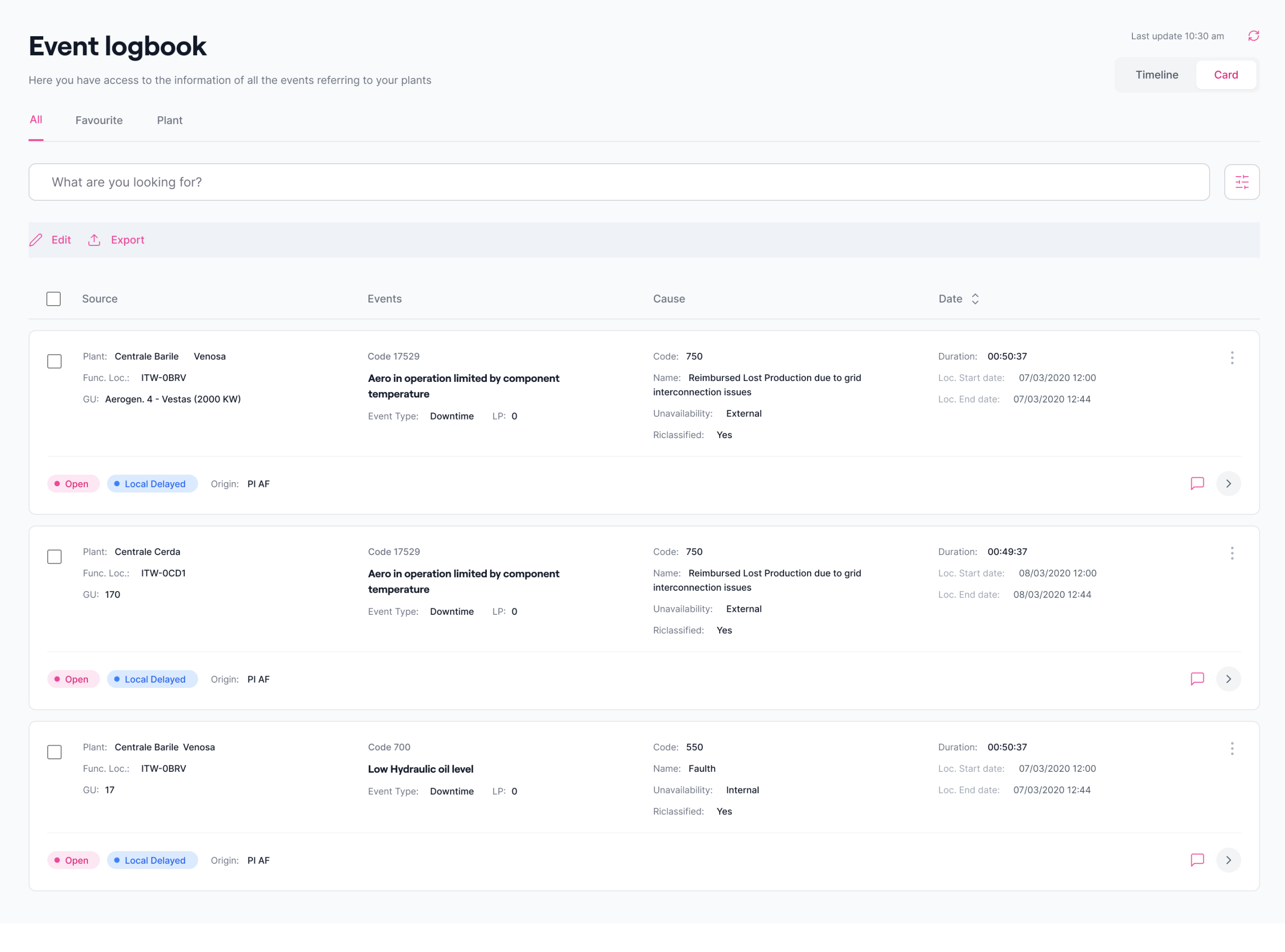
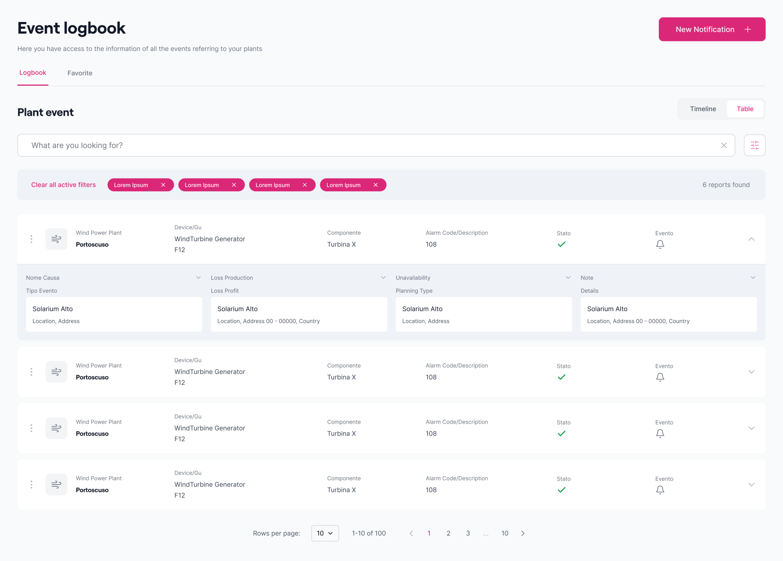
I bringing structure and clarity with detailed wireframes to illustrate how everything would function, to validate them with Ops team who would use the product daily. By understanding the specific tasks employees needed to complete, I crafted a few concepts that directly addressed those needs.
UX Challenge
- Balance the trade-off between A11y and heavy-data informations
- Establish information hierarchy for 30+ recurring fields in each row
- Use pre-approved enterprise design system components
Usability Tests Findings
I conducted moderated card sorting sessions with 8 - 12 cross-country operators.
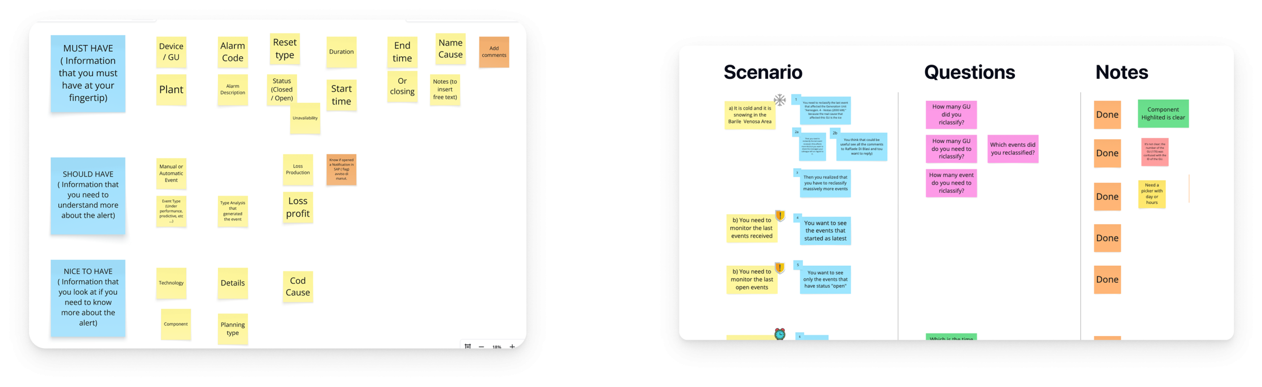
- A/B test showed preferences for a more compact view with less interactions
- Conducted moderated usability tests to de-risk the wrong implementation
- Card sorting helped collect users preferences on hierarchy informations
Design Iterations
The first build, however, led to fail. Continous discovery revealed the real problem. Users had to scroll over 100x events per day.
The new proposal was 2,5x times more compacted, but I iterated on the wrong layout.
Final Solution
Pivotal Moment
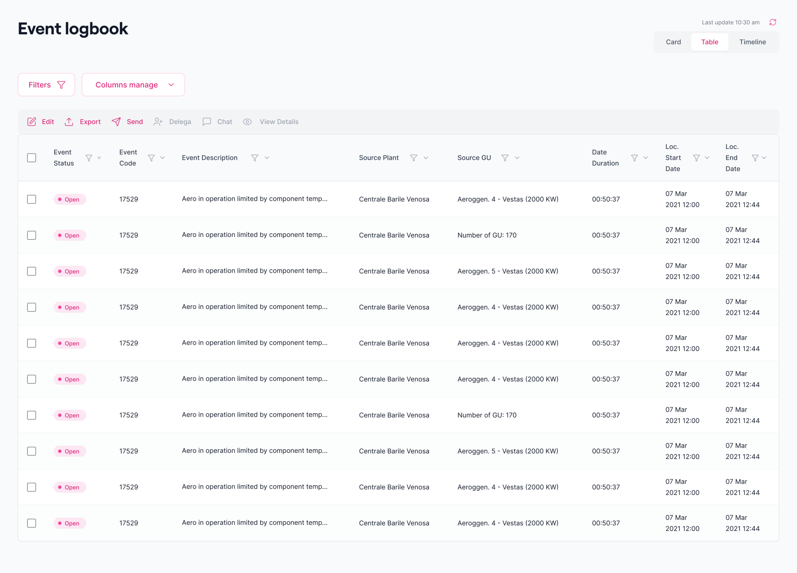
After evaluating usability insights, I pivoted from the original layout to a table view. This created a more compact interface that handled data-heavy events efficiently, improving clarity and helping users manage larger volumes of information.
New challenge
- Translate actions into different visualization modes
- Avoid new patterns and unconsistent visualizations
Results
Insights from new usability testing showed that:
- Operators were interested in accessing a large volume of event data, and they want visibility over as much relevant information as possible.
- Operators expect to switch between views quickly and seamlessly; fluid navigation is key to maintaining their workflow.
Balancing Detail & Simplicity
To avoid clutter, the UI displayed up to 10 anomaly points by default. Hover states revealed deeper metrics, confidence bands, and parameters inline — preserving readability while supporting exploration. A dedicated color token was assigned exclusively to anomaly visualization, ensuring clarity in a dense blue-dominant interface.
Interaction Model
We delivered a new visualization mode that accommodated different country work styles, numbers of events, and key information up front. we used a button activation model for mode selection. This pattern simplified interaction and maintained consistency with Amplitude’s broader design system.
Outcomes
- 2x faster incident reclassification response compared to the previous software
- +76% reclassified incident adoption through table mode compared to the previous card mode
- +38% incident reclassified under compliance compared to the total data source events on 1,475 operating plants
Reflection
Prioritize User Needs Over WCAG AA
Operators in enterprise contexts value efficiency and accuracy over visual or “best practices” on accessibility standards.
Test Realistic Dataset
Enterprise contexts are jargon-heavy, mockups are useful, but actual datasets and concrete good-enough solutions with realistic data change enterily the way users will perceive the solution.
© SIMONE PULVIRENTI 2026
I'm excited to work together!
Say hi to drsimone.pulvirenti@gmail.com
https://www.linkedin.com/in/simonepulvirenti/
