Delivered product value in under 2 minutes to scale Spoki 2M ARR, designing a conversational onboarding experience that reduced TTV by 40x
Summary
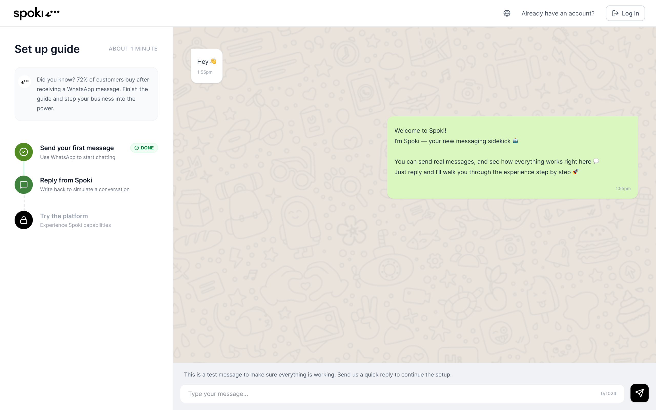
I redesigned Spoki's onboarding experience to accelerate time-to-value. By identifying friction points, validating the right "aha moment," and introducing an interactive QR code flow, I increased conversion by 50% and reduced time-to-activation by 40x; fundamentally changing how users experienced product value from their very first interaction.
Focus: Activation, Retention and Conversion
Role & Scope
Title: Founding UX/Product Designer, Growth & Adoption
I established the design process from the ground up, leading end-to-end discovery, prototyping, validation, and measurement. I partnered closely with product, engineering, and sales teams to define solutions that balanced user needs with business outcomes.
Design challenge
Design a scalable onboarding experience for an "aha moment" faster — turning passive exploration into active product engagement within minutes. Help users experience product value immediately, before they churn. Navigatin uncertainty of betting on the wrong aha moment.
Outcomes
- 50% increase in conversion from aha moment to sign-up
- 40x faster time from aha moment to sign-up (97% reduction in average time)
- 6.83% increase in total conversion from aha moment → sign-up → purchase
Context
Spoki experienced explosive growth between 2021 and 2024, doubling revenue year-over-year and raising €5.5 million in 2025 from Blacksheep and CDP VC.
But by late 2024, acquisition and activation rates began declining significantly. This was a critical red flag: activation rates directly correlate with retention and long-term revenue. If users didn't activate, we risked losing future monetization opportunities.
The problem wasn't top-of-funnel. Marketing was crushing it, driving strong traffic and healthy sign-up volume. But users weren't converting. They'd land in the platform, click around briefly, then drop off without understanding what Spoki could do for them.
Key Responsibilities
- Mapped end-to-end onboarding flow and identified friction points
- Partnered with product, engineering, and sales to align on user needs and business goals
- Facilitated cross-functional workshops to co-define solutions and validate concepts
- Designed and tested QR code-based activation flow to accelerate time-to-aha moment
- Led A/B testing and post-launch analytics to measure impact and inform iteration
Problem Details
Activation & Retention Dropping
Spoki's growth trajectory depended on converting new sign-ups into active, paying customers. But declining activation rates threatened future revenue and retention. For a high-growth startup post-funding, every lost user represented revenue we couldn't afford to waste. Fixing onboarding wasn't just a UX improvement — it was a business-critical lever for sustainable growth.
No Upfront Value
From an acquisition perspective, performance was strong. But users failed to activate because they couldn't feel Spoki's value quickly enough.
Why It Mattered
Spoki's core value was enabling businesses to automate WhatsApp conversations at scale. But if users didn't experience that automation live and in real-time, they'd never understand the product's potential.
By accelerating time-to-value and reducing friction, we could:
- High drop-off rates post-sign-up despite strong top-of-funnel metrics
- Lost revenue from leaked prospects every day the friction persisted
- Risk of compounding retention issues as inactive users churned
Goals
- Increase newly registered customers and set users up for long-term retention
- Reduce time from sign-up to first value interaction
- Unlock faster monetization as users moved from aha moment to purchase
- De-risk growth strategy by ensuring acquisition efforts converted into paying customers
Core Onboarding Experience
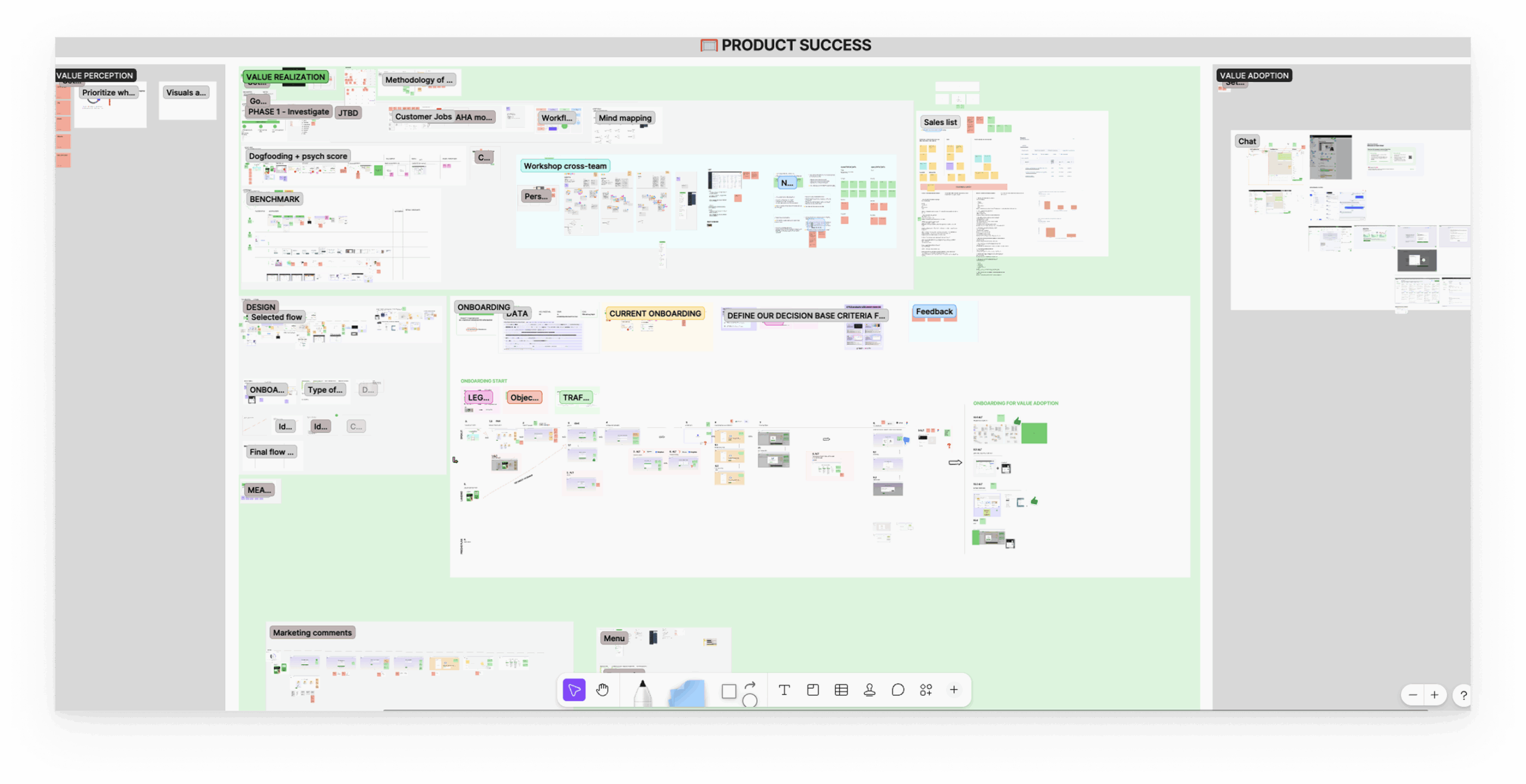
Journey mapping revealed onboarding gaps, which I used to informed future backlog priorities and opportunities.
- Marketing team asks for redundant informations
- I focused on enables faster value during the realization phase
- Dead end post-registration causes users to drop off the whole product
Previous Design
I started by walking through the end-to-end sign-up experience, evaluating each step for friction and motivation impact.
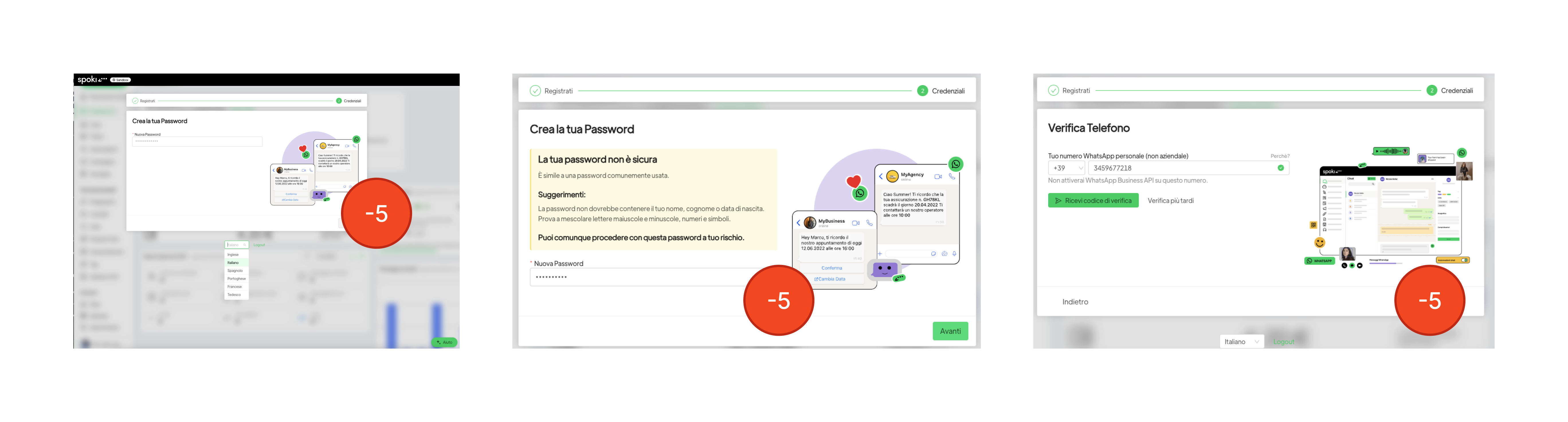
Using the Psych Score framework — a method for measuring users' emotional energy throughout a flow — I rated each interaction to see how it affected their willingness to continue.
Friction Points
- Cluttered interfaces and unclear navigation forced users to think harder, leading to fatigue and frustration
- Poor button placement, inaccessible elements, and unclear steps disrupted the journey — especially critical during onboarding
- Missing keyboard navigation, low contrast, and poor affordances excluded users with disabilities or assistive technologies
The Discovery Process
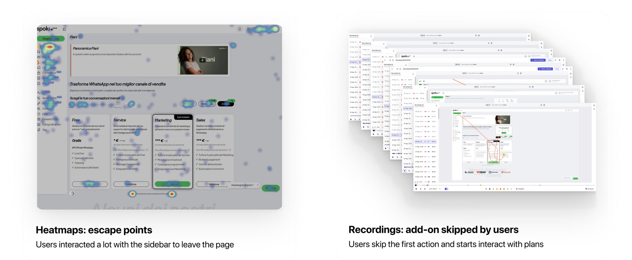
Data
- The sign-up flow itself performed reasonably well
- Most drop-off occurred between the first and second steps
- But users weren't reaching their "aha moment" after completing sign-up
Activation is linked to retention and monetization — the end business outcomes we cared about. If users didn't experience value post-sign-up, they'd churn before converting. The data confirmed our focus: optimize sign-up and accelerate the aha moment.
Attempted Surveys
I partnered with the sales team to send surveys to leads and deals, asking which benefits mattered most to them. Unfortunately, response rates were too low to provide meaningful data.
Cross-functional Collaboration
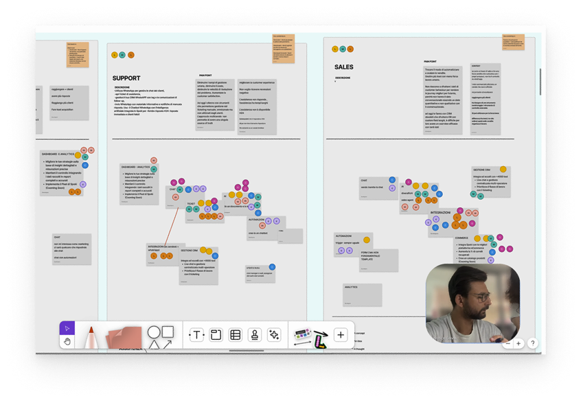
I used cross-functional team members as a resource. Since they interacted daily with customers, leads, and deals, I asked them to advocate for users and vote on which actions best represented the "aha moment."
Conversational Chat
The most-voted action was conversations — confirming that experiencing a live WhatsApp interaction was the right aha moment to optimize for.
Design & Validation
Design Sprints & Workshops
After discovery, I had clearer insights into user and business needs. I ran a workshop to ignite creativity and align the team around potential solutions.
Using early sketches, we explored ideas together, weighing pros and cons and discussing why certain steps made sense in the user journey.
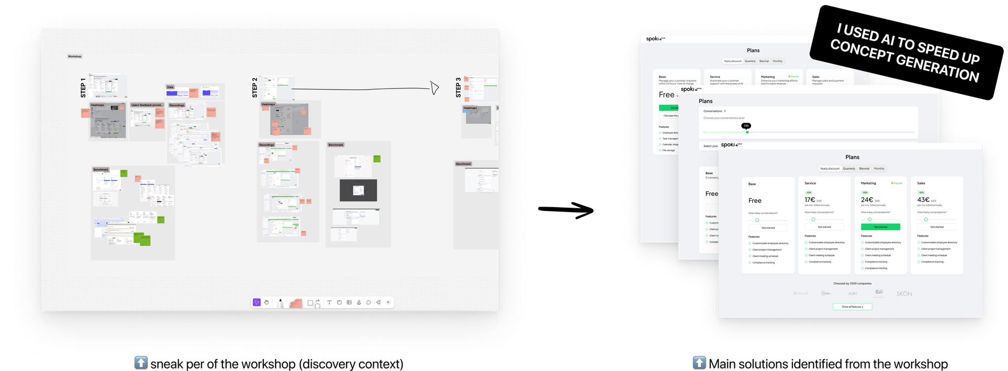
Solutions Identified
- Motivate users to send the first message to reach the aha moment faster
- Introduce an interactive onboarding process before the sign-up page
- Develop a JTBD (Jobs-to-be-Done) onboarding flow to help users recognize value sooner
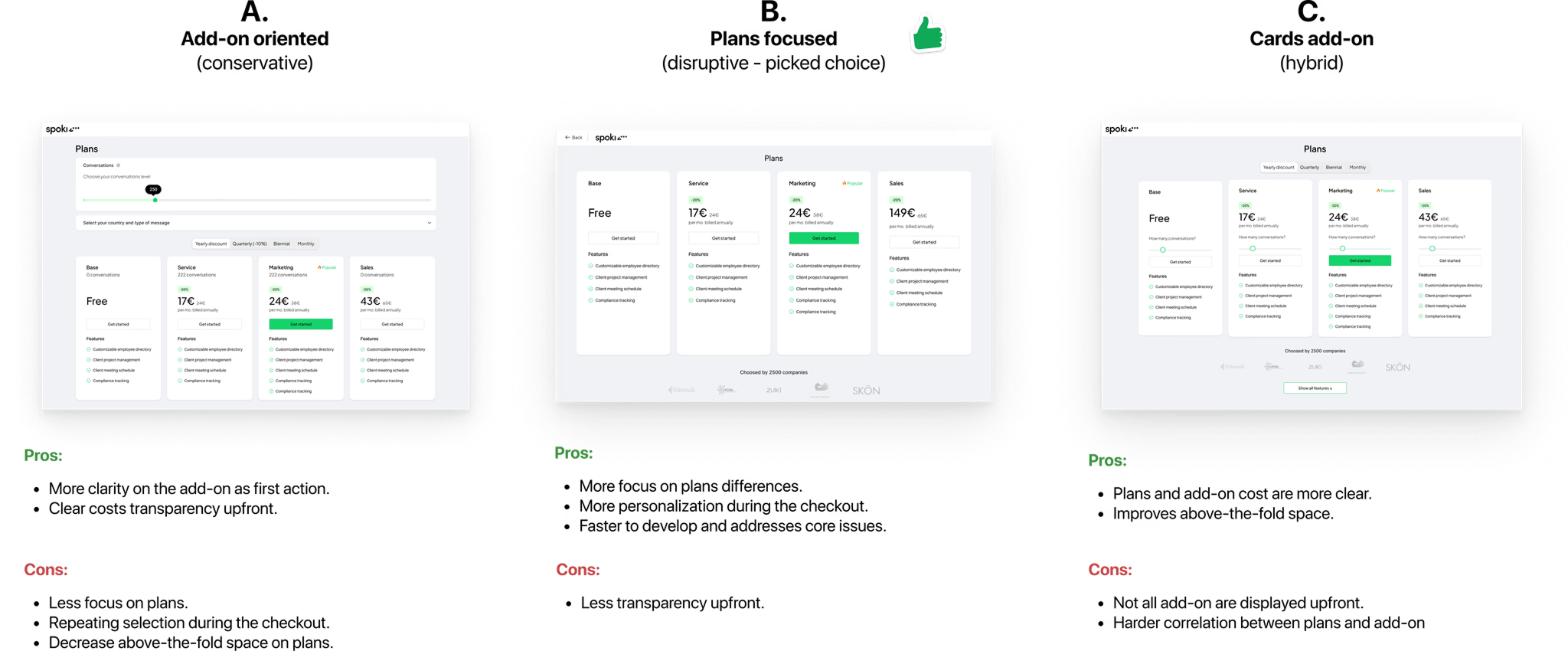
Final Designs
How It Worked
- Users reached the onboarding step and saw a unique QR code tied to their session
- They scanned it with their phone, opening WhatsApp with a pre-populated message
- Sending the message triggered our WhatsApp Business API and activated a pre-built automation
- Users received an instant automated response — experiencing Spoki's core value live, within seconds
Why This Worked
- Users experienced the product's value, not just read about it
- The pattern was familiar (analogous to WhatsApp Web QR login)
- It differentiated Spoki's onboarding from competitors' form-based flows
- It created immediate motivation to continue exploring the platform
Outcome
We fundamentally changed how users valued the product from their very first interaction. This was a case where investing more upfront in a validated, high-impact concept paid off immediately — and set a foundation for sustainable growth.
- 50% increase in conversion from aha moment to sign-up
- 40x faster time from aha moment to sign-up (97% reduction in average time)
- 6.83% increase in total conversion from aha moment → sign-up → purchase
Reflection
Designing in a fast-paced startup requires balancing speed with rigor. Trust comes from shipping smart, not just fast. By combining lightweight validation, cross-functional collaboration, and disciplined post-launch tracking, we turned a higher-effort concept into a high-confidence bet that delivered measurable impact.
Potential Q&A
© SIMONE PULVIRENTI 2026
I'm excited to work together!
Say hi to drsimone.pulvirenti@gmail.com
https://www.linkedin.com/in/simonepulvirenti/
